|
For this portion design logo I was asked to make 3 different logos that represented something, we where also supposed to make 2 other copies of the original logo. The most frustrating challenge was when I had to fit everything on some of the logos, some things where too big and had to make them smaller to fit. my favorite thing about this logo was the last brand (Flipz) because the skateboard looks so clean in that logo. Something i learned through this process is patience and also how to make cool logos because these where the best logos i probably ever made in my life. 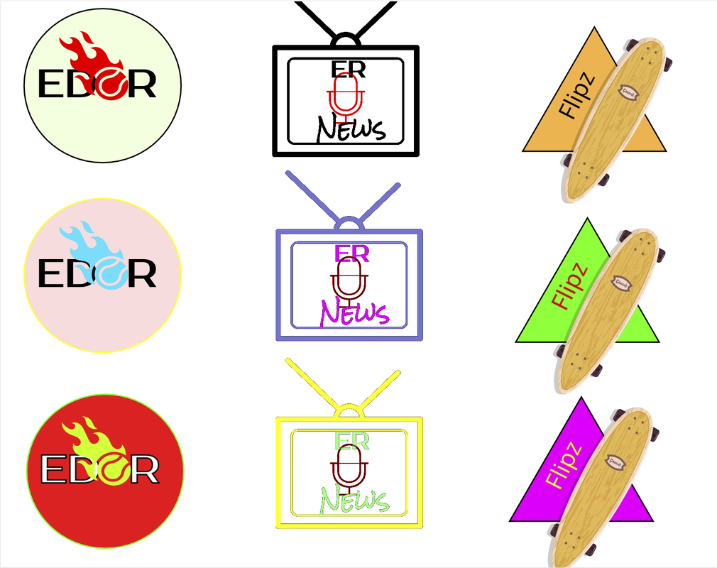 The first brand is just about my self and it is explaining my nickname and what I like to do, and that is a basketball. The brand is about basketball and different ball sports. The logo represents me and the things i like to do, Basketball. it is my favorite because it represents me and how people call me like(Edor). What i think is important about this logo is simplicity(if that even is a word) and easy to understand, not too many things but just simple. 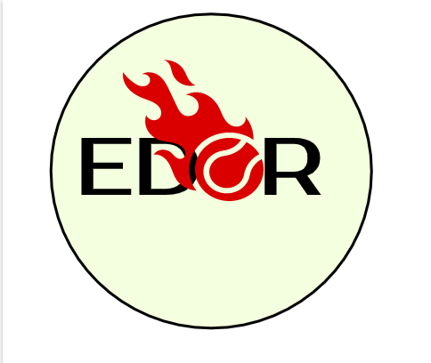
0 Comments
On my logo I thought of making it with things I like to do. Im going to put my initials in the middle and around it i would put things that I like to do, somethings I like to do is play sports like Basketball, Soccer, Volleyball, and other sports. some of my other hobbies I like to do is play video games, or do water activities. this picture below is somethings i want to add on my logo brainstorm. 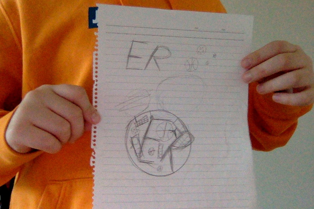 I didn't really face any challenges doing the Color theory Summative the only one was choosing what color to do. I also Kinda struggled on writing all the RGB and HEX colors. I overcome these challenges just by thinking faster and deciding a perfect color. I achieved being patient and being faster at deciding and writing down the text. i am proud of all the different colors I did, I really like the light blues and the purple. on gravit I only used stars, text boxes and different colors. the inspiration behind this is positivity and color, maybe they don't match that well but I tried my best. 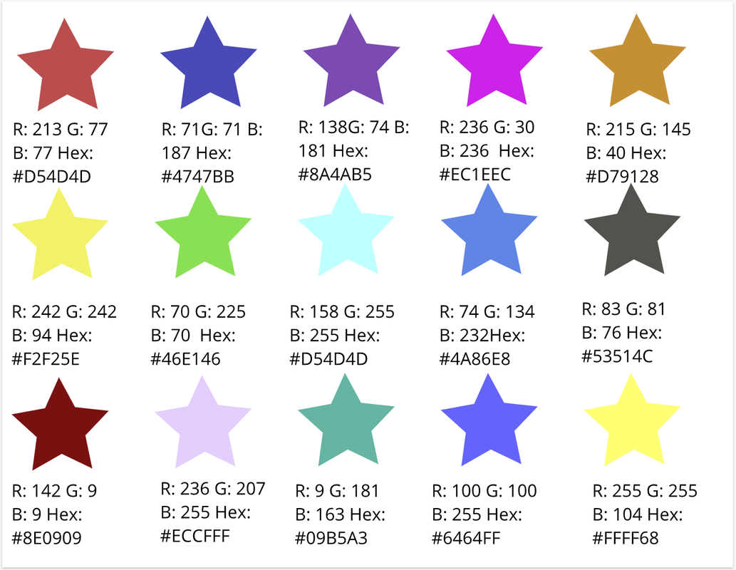 Typography is fonts and words, let's say the type of font, the size the letter. Typography is important for writing things and notes example let's say u want to write DO NOT TOUCH and you put a really funky font people wont understand or take it seriously. each font has a purpose because it is what they are, you can't write it as another thing. in this class we learned Serif font, Sans Serif, monospace, Novelty, and Script. we learned in class and we used the same ones also for then we also learned that comic sans is really bad and people started using it after this guy made it. also for this assignment we had to find different fonts on dafont.com. 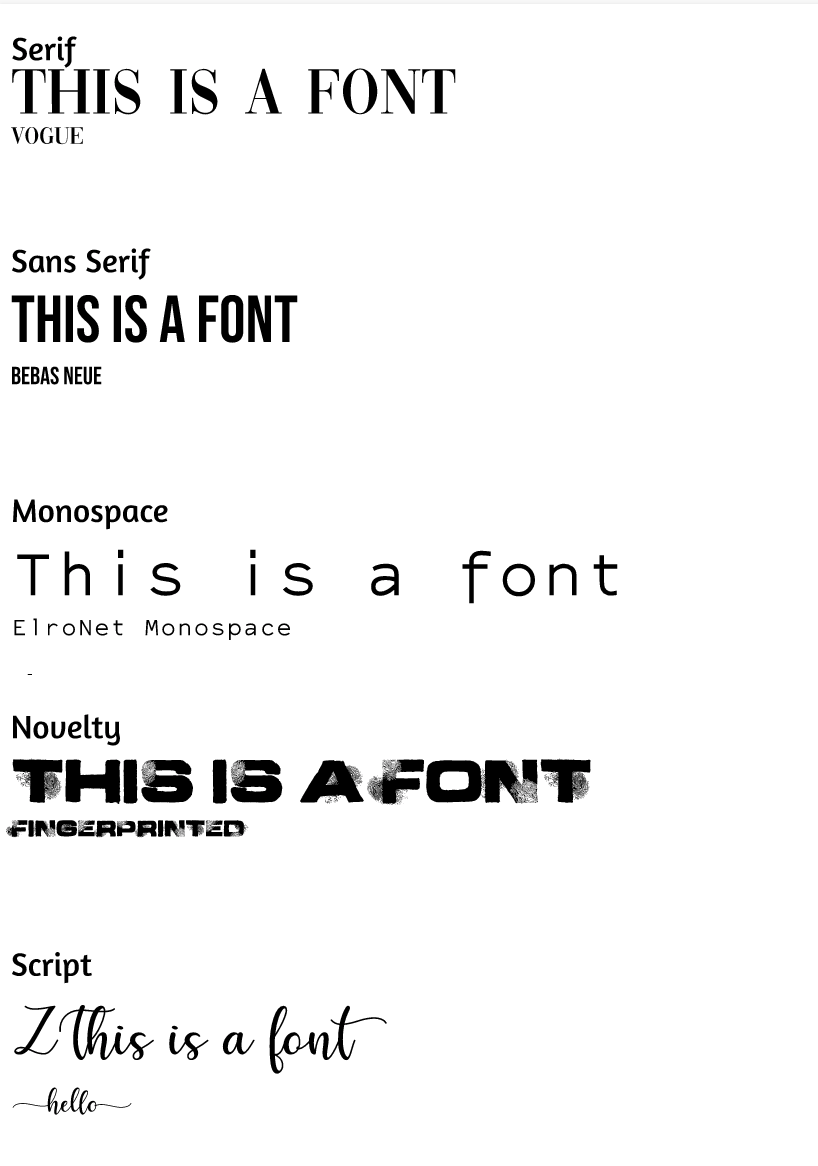 Word Portrait For this assignment we had to make words with fonts that match each other like the first one water and press to start don't match at all. I could make it pretty well even though some of them kinda look alike. 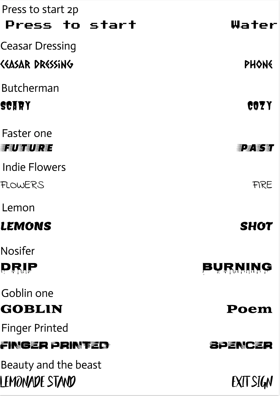 I got pretty confident in doing pen tool and now I am pretty good at pen tool. The first ones where really easy to make but then I got stuck at the batman one it was hard but once I got it it was ok. Also the spider man logo was hard and the penny didn't take me as long as all of them but the summative was complex to make because I had to cut put some pictures and then the last part was probably the hardest because I put my face as if i'm looking at that guys and it took me really long because there are probably 400 of my faces in the back and I can call it pretty complex to do. 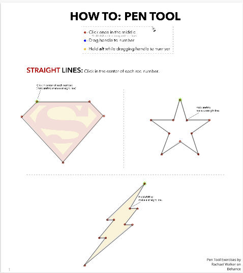 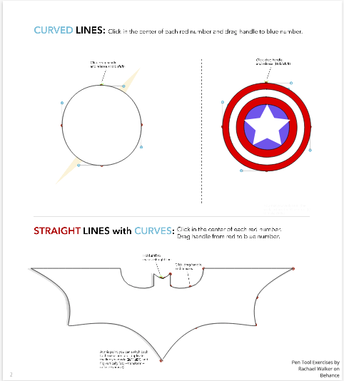 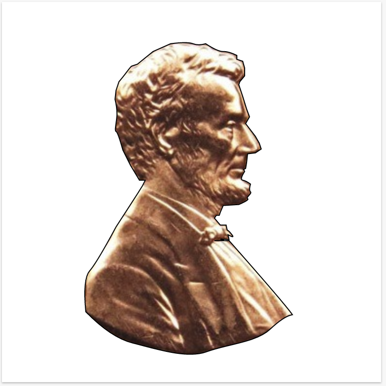 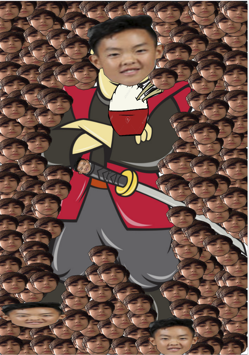 I made this drawing using Gravit it represents me because I like gaming and I really enjoy playing in the free time so I thought making this would show people more about me and what I do. I also stream and I think it is really fun when you get started. 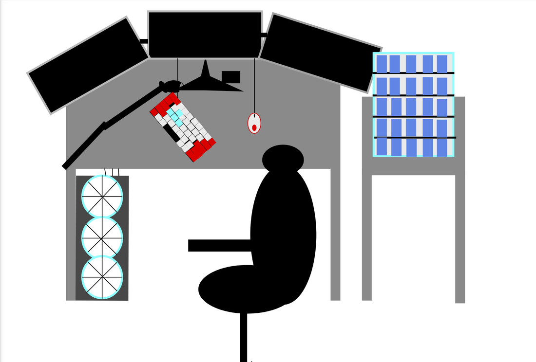 |
AuthorTwitch streamer Edorisadefault, and likes memes¯\_(ツ)_/¯ Archives
November 2019
Categories This work is licensed under a Creative Commons Attribution-NonCommercial-NoDerivatives 4.0 International License. |